Product Tours vs. Interactive Walkthroughs: Which Is Better for SaaS Onboarding?
The first few minutes a new user spends inside a SaaS product will dictate the entire future of their relationship with that software. If they find value quickly, they are highly likely to convert into paying, long-term customers. If they are greeted by a confusing interface or overwhelmed by an avalanche of unhelpful information, they will churn before they even begin. This critical window of time has sparked an ongoing debate in user experience (UX) and onboarding design circles: when looking at product tours vs interactive walkthroughs, which approach truly drives user activation?
For software companies, building an intuitive onboarding sequence is just as important as building the core product itself. But the methodology behind how we introduce users to new interfaces has evolved. Historically, companies relied on passive, multi-step slideshows to point out features. Today, the shift is moving toward hands-on, action-driven learning.
In this comprehensive guide for NudgeSaaS, we will break down the fundamental differences between these two methodologies, explore the cognitive psychology behind how users learn software, and provide an actionable framework for deciding which onboarding UX is right for your specific product layout.
1. What is a Traditional Product Tour?
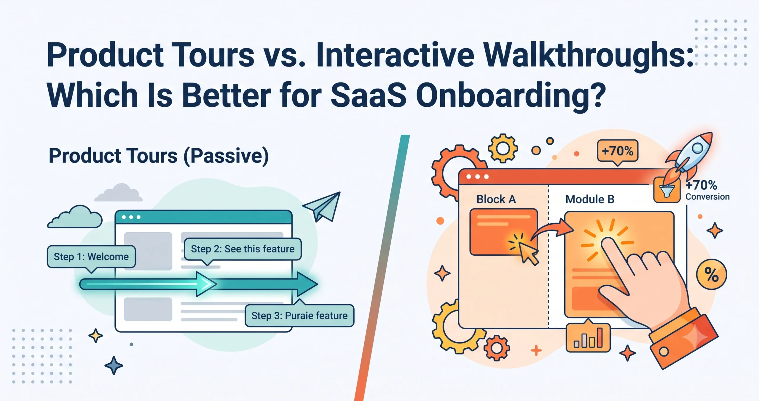
A traditional product tour is a passive, linear sequence of informational overlays designed to introduce a user to a software interface. Usually triggered immediately after a user creates an account and logs in for the first time, these tours typically consist of a welcome modal followed by a series of tooltips. Each tooltip highlights a specific button, navigation menu, or dashboard element, accompanied by a brief text explanation and a “Next” button.
The defining characteristic of a traditional product tour is its passivity. The user is not required to interact with the underlying software; they are only required to click “Next” on the tooltips themselves to advance the sequence. It acts much like a digital museum guide, pointing at artifacts behind glass while the user stands by and observes.
The Pros of Product Tours
- Low Barrier to Entry: Because they do not require users to perform complex actions, product tours are frictionless. A user can click through an entire tour in a matter of seconds, getting a broad bird’s-eye view of the software’s capabilities without having to commit cognitive energy to data entry or setup.
- Rapid Deployment for Teams: From a product management and engineering perspective, traditional tours are relatively easy to build. Using digital adoption platforms like NudgeSaaS, a non-technical product manager can map out a tooltip sequence over an existing UI in a single afternoon without writing custom code.
- Broad Feature Exposure: If your goal is simply to let users know that a specific feature exists (even if they don’t need to use it right away), a quick tour is an efficient way to plant that seed for future reference.
The Cons of Product Tours
- The “Next, Next, Skip” Phenomenon: Because traditional tours interrupt the user’s primary goal (exploring the software themselves), they are frequently perceived as an annoyance. Users routinely develop “tooltip blindness,” rapidly clicking the “Next” or “Skip” buttons just to clear the screen, completely ignoring the carefully crafted copy.
- Low Knowledge Retention: Reading about how a feature works is fundamentally different from using it. When users passively read tooltips without taking action, the information rarely transitions into long-term memory.
- Context Detachment: Tours often force users to look at advanced features before they have completed basic setup steps, rendering the information irrelevant to their immediate context.
2. What is an Interactive Walkthrough?
An interactive walkthrough (often referred to as a “hands-on” or “action-driven” walkthrough) flips the traditional onboarding model on its head. Instead of asking the user to read about the software, it forces the user to use the software to progress.
In an interactive walkthrough, the onboarding flow pauses and waits for the user to complete a specific, real-world action within the native UI. For example, rather than a tooltip saying, “Click here to create a new project,” the walkthrough places a pulsating hotspot over the “New Project” button and will not advance until the user actually clicks it, types a project name, and hits save.
The Pros of Interactive Walkthroughs
- Learning by Doing: By requiring users to interact with the interface, interactive walkthroughs build muscle memory. Users aren’t just memorizing where a button is; they are experiencing the workflow.
- Immediate Time-to-Value (TTV): Because the walkthrough forces users to take core actions, by the time the onboarding is complete, the user has already achieved a meaningful milestone—such as integrating an API, importing a contact list, or sending their first message.
- Higher Engagement Rates: Interactive elements naturally capture attention. Because the user is placed in the driver’s seat, they are an active participant in their own success, which drastically reduces the likelihood of them abandoning the application entirely.
The Cons of Interactive Walkthroughs
- Higher Friction: Asking a user to do actual work during onboarding requires more effort on their part. If the requested action is too complex or requires data the user doesn’t have on hand, they may get stuck and abandon the flow.
- Resource Intensive to Build: Designing an interactive walkthrough is significantly more complex than laying down a series of passive tooltips. It requires careful state management to ensure the onboarding layer reacts correctly to the user’s inputs, API calls, and screen changes.
- Potential for “Onboarding Jail”: If an interactive walkthrough is too rigid and doesn’t allow a user to exit or skip a step they aren’t ready for, they can feel trapped, leading to immediate frustration and churn.
3. The Science Behind Active Learning and Knowledge Retention
When comparing product tours vs interactive walkthroughs, the debate isn’t just about UI aesthetics; it is rooted deeply in cognitive psychology and how the human brain processes and retains new information.
The concept of “learning by doing” (experiential learning) is heavily supported by decades of educational and cognitive research. When users are placed in a passive learning environment—such as clicking “Next” on a traditional product tour—they are engaging in recognition memory. They recognize the UI elements as they are pointed out, but this does not translate into recall memory. When the tour ends and the user is left to their own devices, they often cannot recall where the settings menu was or how to initiate a core workflow.
Interactive walkthroughs, however, leverage the Generation Effect. This psychological principle states that information is better remembered if it is actively generated from one’s own mind and physical actions rather than simply read. When a user has to physically move their mouse, click a dropdown, type in a value, and submit a form during an interactive walkthrough, they are utilizing kinesthetic learning.
Furthermore, interactive walkthroughs manage Cognitive Load far better than passive tours. Extraneous cognitive load occurs when a user is bombarded with too much information at once (e.g., an 8-step tooltip tour covering every corner of the dashboard). Interactive walkthroughs rely on progressive disclosure—revealing only the exact information needed to complete the immediate next step. This keeps the brain focused on a single micro-conversion, securing the knowledge before moving on to the next concept.
4. When a Simple Product Tour is Still the Right Choice
Despite the strong advantages of interactive learning, traditional product tours are not entirely obsolete. There are specific scenarios in SaaS UX design where a lightweight, passive product tour is actually the superior choice.
- Consumer-Grade, Ultra-Simple Applications: If your application is highly intuitive, mimics standard design patterns that users are already intimately familiar with, and requires almost zero setup, an interactive walkthrough is overkill. A quick, three-step passive tour is more than enough to orient the user.
- Feature Announcements: When rolling out a new feature to existing, experienced users, you don’t want to force them through a mandatory interactive exercise. A simple tooltip that says, “We’ve moved the export button here, and it now supports CSV formats” is the polite, frictionless way to handle UI updates.
- Empty States and Dashboard Overviews: Sometimes a user lands on a dashboard that is entirely empty because they haven’t generated any data yet. A passive tour can be used to overlay “dummy data” visually, showing the user what the dashboard will look like once they start using the product, providing motivation without demanding immediate complex data entry.
5. When Interactive Walkthroughs Are Worth the Extra Design Effort
The true power of interactive walkthroughs is unleashed when dealing with highly sophisticated software where the learning curve is steep, and the cost of user error is high. The more specialized the platform, the more critical hands-on onboarding becomes.
Consider highly technical environments where users must process complex data, such as proprietary financial trading firms where operations agents manage dense system escalations and ticket adjustments, or visually intricate interfaces like the FundedNext futures platform. In these environments, the platform interface design is inherently complex due to the sheer volume of data, charts, and execution tools on screen.
You cannot teach a user how to manage a proprietary trading dashboard or execute a futures contract via a passive tooltip. The interface layout demands an interactive approach. Users need to build exact muscle memory by executing a mock trade, setting real stop-loss parameters, or processing a simulated client escalation ticket. By forcing the user to engage with the actual visual layouts and platform interfaces they will use daily, you transition them from confused beginners to confident operators before they even touch live data.
Other scenarios that demand interactive walkthroughs include:
- Platforms with Complex Setup Requirements: CRM systems, email marketing automation tools, and ERPs where a user must connect APIs, map data fields, and build logic trees to get any value.
- Products with a High “Aha!” Moment Threshold: If your product’s core value isn’t realized until the user actually completes a specific workflow (e.g., generating their first AI image, sending their first invoice), an interactive walkthrough that holds their hand until that exact moment is essential.
6. Hybrid Approaches: The Strategy of Mature SaaS Products
The most successful SaaS companies do not view product tours vs interactive walkthroughs as a strict binary choice. Instead, they utilize a hybrid approach, leveraging the strengths of both methodologies to create a seamless, non-intrusive, yet highly effective onboarding flow.
A standard hybrid approach often looks like this:
- The Welcome Modal: A warm, branded welcome screen that sets expectations and perhaps asks the user 1-2 profiling questions (e.g., “What is your primary goal today?”).
- The Passive Orienting Tour (Micro-Tour): A very brief (2-3 steps max) passive tour that points out only the most critical overarching navigation elements, such as the main menu and the help center.
- The Opt-In Interactive Walkthrough: Instead of forcing the user immediately into a hands-on task, the UI introduces a subtle onboarding checklist or a non-modal prompt (e.g., “Ready to launch your first campaign? Click here to start the guide”). When the user clicks, the deep, interactive, learn-by-doing walkthrough begins.
This hybrid model respects the user’s autonomy. It provides a quick lay of the land for users who just want to poke around safely, while offering deep, guided, interactive assistance exactly when the user is ready to do the actual work.
7. How to Design an Effective Interactive Walkthrough Step-by-Step
Building an interactive walkthrough requires careful planning. If designed poorly, it can feel like a labyrinth the user can’t escape. Follow these steps to design a walkthrough that drives activation:
Step 1: Define the “Aha!” Moment
What is the single core action a user must take to realize the value of your product? For a social media scheduler, it’s scheduling a post. For a payroll app, it’s adding an employee. Your entire walkthrough should be reverse-engineered from this single, high-value goal.
Step 2: Map the Shortest Path to Value
Once the goal is defined, map out the absolute minimum number of clicks and keystrokes required to achieve it. Ruthlessly cut out any steps that aren’t strictly necessary. If a user doesn’t need to upload a profile picture to send their first invoice, do not include profile setup in the initial walkthrough.
Step 3: Utilize Contextual Triggers
Don’t launch a massive 15-step walkthrough the second the user logs in. Break the onboarding down into modular chunks. Trigger specific interactive guides only when the user navigates to the relevant section of the app. If they click the “Analytics” tab, trigger the analytics walkthrough then—not before.
Step 4: Use Clear, Action-Oriented Copy
Ditch the passive voice. Instead of saying, “This is where campaigns are created,” use direct, action-oriented instructions: “Click ‘New Campaign’ to get started.” Keep copy incredibly brief. The focus should be on the action, not the text.
Step 5: Always Provide an Escape Hatch (and a Way Back)
Never hold a user hostage. Every step of an interactive walkthrough must have a clearly visible “Dismiss” or “Remind me later” button. Crucially, if a user skips the walkthrough, provide a persistent UI element (like an onboarding checklist widget in the corner of the screen) so they can voluntarily resume the walkthrough when they are ready.
8. Metrics to Compare Effectiveness
To definitively end the debate of product tours vs interactive walkthroughs for your specific software, you must rely on product analytics. Implementing NudgeSaaS allows you to track and compare the performance of your onboarding flows using these critical metrics:
- Completion Rate: This is the baseline metric. What percentage of users who start the tour/walkthrough actually make it to the final step? Traditional product tours often have higher completion rates simply because they are faster, but completion doesn’t equal comprehension.
- Drop-Off Points: Where exactly are users abandoning the flow? If 40% of users drop off at Step 3 of your interactive walkthrough, you know that specific step is either too complex, buggy, or requires data the user doesn’t have.
- Time-to-Value (TTV): How long does it take from the moment of account creation to the moment the user successfully executes the core “Aha!” action? Effective interactive walkthroughs should drastically reduce TTV.
- Downstream Activation & Retention: This is the ultimate tie-breaker. Cohort your users based on which onboarding flow they experienced. Do users who completed the interactive walkthrough have a higher 30-day retention rate than those who clicked through the passive tour? Do they log in more frequently? Do they generate more revenue? Downstream metrics will reveal the true ROI of your onboarding UX.
Conclusion
The product tours vs interactive walkthroughs debate ultimately boils down to user psychology and product complexity. While passive product tours have their place in simple announcements and consumer apps, the B2B SaaS landscape demands more. To truly activate users, reduce churn, and drive long-term retention, companies must embrace the “learn by doing” philosophy.
By designing interactive walkthroughs that guide users directly to value, respect their time, and build real muscle memory, you stop telling users why your software is great, and start showing them.
Frequently Asked Questions (FAQ)
1. Can I use both product tours and interactive walkthroughs in my app? Absolutely. The best SaaS products use a hybrid approach. You can use a short, passive product tour for a general welcome and high-level navigation overview, and reserve interactive walkthroughs for complex, multi-step tasks like setting up a first project or integrating an API.
2. Are interactive walkthroughs annoying for experienced users? They can be if forced. This is why you must always include a “Skip” or “Dismiss” button. Additionally, good onboarding platforms allow you to segment users based on their role or experience level, ensuring power users can bypass basic interactive guides entirely.
3. How long should an interactive walkthrough be? The rule of thumb is “as short as possible to achieve value.” Ideally, an interactive sequence should not exceed 4 to 6 steps. If a workflow requires 20 steps, break it down into smaller, bite-sized modules that the user can complete at their own pace.
4. Do I need a developer to build an interactive walkthrough? Historically, yes. Building state-aware walkthroughs required custom code. However, modern digital adoption platforms like NudgeSaaS allow product and marketing teams to build deep, interactive workflows over native elements visually, without writing a single line of code.
5. How do I know if my onboarding flow is actually working? Look at your downstream retention, not just your tour completion rates. If users are finishing your product tour but still churning within 14 days or overwhelming your support team with basic “how-to” tickets, your onboarding flow is failing to impart actionable knowledge. It’s time to switch to a more interactive approach.