Behavioral Nudges in SaaS Products: Psychology-Backed Growth Tactics That Work
When a user logs into a complex software interface—whether it is an advanced e-commerce management dashboard or a high-performance proprietary trading platform—every element they interact with is part of a carefully constructed environment. This environment dictates how easily they find value, how deeply they engage, and ultimately, whether they churn or upgrade.
Understanding how to optimize this environment requires a deep dive into the concept of choice architecture. Coined by behavioral economists Richard Thaler and Cass Sunstein, choice architecture refers to the practice of influencing choice by changing the manner in which options are presented to people.
At the heart of choice architecture is the “nudge.” A nudge is a small design change that alters people’s behavior in a predictable way without forbidding any options or significantly changing their economic incentives. To count as a mere nudge, the intervention must be easy and cheap to avoid.
In the digital landscape, leveraging behavioral nudges SaaS companies use can mean the difference between a stalled user base and a thriving, activated community. This definitive guide by NudgeSaaS explores how psychology-backed growth tactics work, how to implement them, and how to maintain ethical standards while driving product-led growth.
What is a ‘Nudge’ in the SaaS Product Context?
In the context of Software-as-a-Service (SaaS), a nudge is not a forceful pop-up that blocks the screen until a user submits their credit card. Nor is it a deceptive design meant to trick someone into an annual subscription.
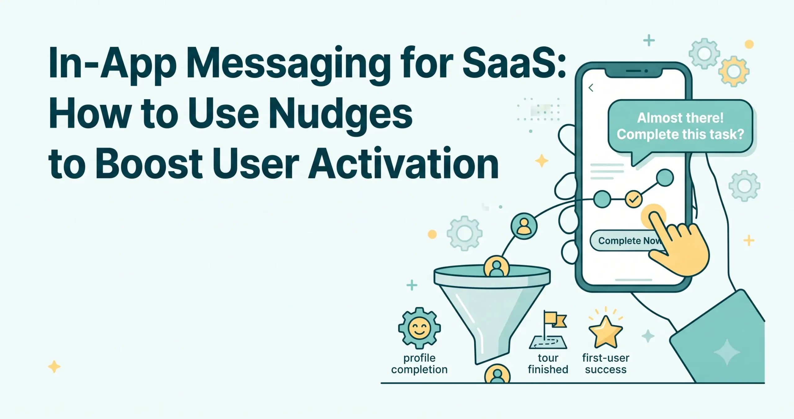
Instead, a nudge in a SaaS product is a subtle, context-aware prompt designed to help users overcome friction, reduce cognitive load, and make decisions that align with both their own goals and the platform’s growth metrics. When dealing with intricate user interfaces, cognitive fatigue is a real threat. A well-placed nudge acts as a signpost, gently guiding the user toward the “happy path”—the optimal sequence of actions that leads to product activation and long-term retention.
Behavioral nudges SaaS teams deploy are uniquely powerful because they rely on inherent human psychology rather than aggressive sales tactics. They recognize that human beings are boundedly rational; we take mental shortcuts (heuristics) when making decisions. By designing software interfaces that align with these natural mental shortcuts, SaaS products can guide user behavior seamlessly.
8 Core Nudge Patterns Used in SaaS
The most successful SaaS platforms utilize a combination of psychological principles to guide their users. Here are the eight core nudge patterns that drive growth, engagement, and retention.
1. Default Settings (The Path of Least Resistance)
Humans are naturally predisposed to accept the status quo. In SaaS, setting a smart default is one of the most effective nudges available. When users are presented with a complex array of choices, they will almost always stick with the pre-selected option because it requires zero cognitive effort.
- Application: Pre-selecting the “Annual Billing” option on a pricing page, or automatically enabling weekly summary report emails in a user’s dashboard settings.
2. Social Proof Indicators (The Wisdom of the Crowd)
When uncertain about what action to take, people look to the behavior of others. Social proof validates a user’s decision to engage with a product or feature by demonstrating that their peers are already doing it successfully.
- Application: Highlighting the “Most Popular” tier on a pricing matrix, or displaying subtle notifications like “15,000 other e-commerce store owners use this integration.”
3. Progress Indicators and Completion Bars (The Zeigarnik Effect)
The Zeigarnik Effect dictates that people remember uncompleted or interrupted tasks better than completed ones, creating a psychological tension that drives them to finish what they started.
- Application: Displaying a circular progress bar reading “Profile 80% Complete” at the top of a user dashboard. This compels users to take the final steps, such as connecting their bank account or uploading an avatar, to reach 100%.
4. Scarcity and Urgency Cues (Fear of Missing Out)
We assign higher value to things that are scarce and lower value to things that are abundant. Urgency is the temporal cousin of scarcity, compelling immediate action to avoid missing out on a specific benefit.
- Application: Countdown timers on limited-time promotional upgrades (e.g., “Unlock Pro Features at 50% off – Offer ends in 2:00:00”).
5. Anchoring in Pricing Pages (Relativity in Decision Making)
The anchoring effect occurs when individuals rely too heavily on an initial piece of information (the “anchor”) when making decisions. In SaaS pricing, presenting a high-priced tier first or alongside standard tiers makes the standard tiers appear significantly more affordable.
- Application: Displaying an “Enterprise” plan for $499/month directly next to a “Pro” plan for $49/month. The $49 plan feels like a bargain compared to the anchor price.
6. Commitment and Consistency (Checklists and Small Wins)
Once a person commits to a small action, they are more likely to follow through with larger, related actions to remain consistent with their initial commitment.
- Application: Breaking down a massive setup process into a digestible, three-step checklist. Once the user clicks the first box, their psychological desire for consistency drives them to complete the remaining two.
7. Loss Aversion Framing in Churn-Prevention (Valuing What We Have)
Psychological studies show that the pain of losing something is roughly twice as powerful as the pleasure of gaining the equivalent thing. Framing messages around what a user stands to lose is highly effective in retention efforts.
- Application: During a cancellation flow, instead of saying, “Stay to get more features,” a platform might say, “If you cancel, you will permanently lose access to your 14 customized trading dashboards and 2 years of historical data.”
8. Reciprocity (Free Value Before the Ask)
When someone does something nice for us, we feel a deep-seated psychological urge to return the favor. Providing unexpected value upfront builds goodwill and increases the likelihood of a user saying “yes” to a future request.
- Application: A freemium product providing an unprompted, free 7-day trial of premium features, or offering a highly valuable, ungated proprietary report directly to a user’s inbox before asking them to upgrade.
Real-World Examples: Applied to Onboarding, Activation, and Retention
To truly master behavioral nudges SaaS companies must integrate these psychological principles seamlessly across the entire user lifecycle. Below are examples of how these patterns map to crucial growth phases. Be sure to explore our deeper, dedicated resources on onboarding, activation, and retention for extended strategies.
Onboarding: Creating Early Momentum
The onboarding phase is where users are most vulnerable to churn. They are learning a new interface and forming their initial impressions.
- The Checklist Nudge (Commitment & Progress): A user signs up for a new financial platform. Instead of dumping them into an empty interface, they are greeted by a sleek setup widget: 1. Connect API (Done) -> 2. Customize Visual Layout -> 3. Execute First Mock Trade. The progress bar sits at 33%. The user feels a natural compulsion to finish the sequence.
- The Default Nudge: During account creation, the software automatically toggles on “Guided Tour Mode” rather than asking the user if they want help.
Activation: Reaching the ‘Aha!’ Moment
Activation happens when the user realizes the product’s core value. Nudges here should point directly to the features that drive this realization.
- The Social Proof Nudge: A user is exploring an e-commerce integration store but hasn’t installed anything. A subtle nudge suggests, “Top-performing merchants in your category use the Inventory Sync app. Install now?”
- The Reciprocity Nudge: A user hits a paywall when trying to generate an advanced report. Instead of a hard block, the software offers a one-time “Unlock this report on us” button, giving them a taste of the premium value and triggering a sense of reciprocity.
Retention: Minimizing Churn and Driving Expansion
Keeping users engaged long-term requires reminding them of the value they’ve accrued and gently increasing their investment in the platform.
- The Loss Aversion Nudge: When a user clicks “Downgrade Plan,” a modal appears visualizing exactly what they are giving up—showing greyed-out icons of their active integrations and a warning that stored data will be archived in 30 days.
- The Urgency Nudge (Expansion): A user approaching their monthly usage limit receives an in-app banner: “You have used 90% of your credits. Upgrade within the next 24 hours to lock in our legacy pricing tier before the rate increases.”
Ethical Considerations: Nudges vs. Dark Patterns
At NudgeSaaS, we strongly advocate for user-respecting design. There is a fine line between a helpful nudge and a manipulative “dark pattern”—also sometimes referred to as “sludge.”
A true nudge is transparent, easily avoidable, and ultimately aligns with the user’s best interests. A dark pattern relies on deception, confusion, or coercion to trick users into actions they did not intend to take.
Examples of Dark Patterns to Strictly Avoid:
- The Roach Motel: Making it incredibly easy to sign up for a subscription, but requiring a phone call during specific business hours to cancel.
- Hidden Costs: Revealing mandatory fees only at the final step of a checkout process.
- Confirmshaming: Phrasing opt-out buttons in a way that aims to guilt the user (e.g., “No thanks, I don’t want to grow my business”).
Ethical behavioral nudges SaaS products use should focus on friction reduction for actions the user wants to take (like learning how to use the tool effectively) and adding healthy friction to destructive actions (like accidentally deleting an entire customer database). When applying these psychological tactics, always ask: Does this design choice respect the user’s autonomy and intelligence?
How to Design and Test Your Own Nudges
Implementing behavioral nudges is not a guessing game; it requires a structured, data-driven approach. Here is the framework for designing and testing nudges in your software.
1. Formulate a Hypothesis
Identify a specific bottleneck in your user journey. For example, if users are signing up but failing to complete their profiles, frame a hypothesis based on behavioral psychology:
- Hypothesis: “By introducing a progress bar (Zeigarnik Effect) at the top of the dashboard, we will increase profile completion rates by 15% because users will feel compelled to close the open loop.”
2. Implement the Minimum Viable Nudge
Design the simplest version of your nudge. Avoid over-engineering the solution. If you are testing a social proof prompt, you might simply add a static text line below a feature button rather than building an elaborate dynamic counter.
3. Run a Controlled A/B Test
Segment your users. Serve the existing interface (Control) to 50% of the audience and the interface with the new behavioral nudge (Variant) to the other 50%. Ensure the test runs long enough to achieve statistical significance.
4. Measure and Iterate
Analyze the data. Did the nudge achieve the desired behavior? Did it inadvertently increase support tickets or cause friction elsewhere? If the test is successful, roll it out permanently. If it fails, iterate on the design or pivot to a different psychological principle.
Checklist for Auditing Your SaaS Product for Nudge Opportunities
Use this practical checklist to audit your platform’s choice architecture and identify areas where behavioral nudges can drive growth.
| Audit Area | Key Question | Psychological Principle to Apply |
| Pricing Page | Are users overwhelmed by choice? | Anchoring & Defaults: Highlight a recommended tier and present a premium anchor price. |
| Onboarding Flow | Do users abandon setup halfway? | Commitment & Consistency: Implement a numbered checklist with the first step already completed. |
| Feature Adoption | Are advanced features ignored? | Social Proof: Add indicators showing how many successful peers use the feature. |
| Upgrade Paths | Do free users ignore upgrade prompts? | Reciprocity: Offer a free sample of the premium feature before asking for payment. |
| Cancellation Flow | Do users churn without hesitation? | Loss Aversion: Visually remind them of the specific data and time-saving workflows they will lose. |
| Account Settings | Are users missing out on valuable alerts? | Defaults: Pre-select beneficial settings (like weekly insights) upon account creation. |
Frequently Asked Questions (FAQ)
1. What is the difference between a nudge and a standard UI/UX design choice?
While all nudges involve UI/UX design, not all UI/UX choices are nudges. A behavioral nudge specifically leverages cognitive psychology to influence decision-making without restricting the user’s options. A standard UI choice might involve making a button larger for accessibility, whereas a nudge might involve placing “Most Popular” text above that button to influence selection.
2. Are behavioral nudges manipulative?
They can be, which is why ethical application is crucial. When nudges are used to trick users (dark patterns), they are manipulative and harmful to long-term brand trust. When used ethically, nudges act as helpful guides that reduce cognitive load and help users achieve their goals within the software.
3. How do I know which behavioral nudge to use?
Start with your data. Identify where users are dropping off or hesitating. If the problem is a lack of motivation during a long setup process, use Progress Indicators. If the problem is indecision on a pricing page, rely on Defaults or Social Proof. Always A/B test to confirm your hypothesis.
4. Can implementing behavioral nudges in SaaS replace good product functionality?
No. Behavioral nudges are amplifiers, not foundational fixes. If your SaaS product lacks core utility, is highly buggy, or fails to solve a real problem, no amount of choice architecture will save it. Nudges only work when guiding users toward genuine value.
5. How quickly can I expect to see results after implementing a nudge?
Because nudges target immediate cognitive reflexes, you can often see changes in user behavior as soon as the A/B test reaches statistical significance—sometimes within a matter of days or weeks, depending on your platform’s traffic volume and user base size.